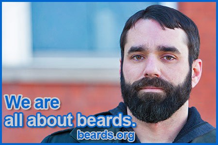
Today all about beards launched phase one of our site renovation at http://www.beards.org ! Please excuse any inconvenience should you find something not working during this transition. Everything is pretty much working now, but small issues may still be found here and there until all are identified and eliminated. More changes and improvements are on the way.

Well, let me start by saying that the old interface – which stood the test of time and lent the site a nostalgic, pre-millennial, early-Internet charm – had probably run its course by now. Its replacement – a highly-polished, clean, duochrome template featuring a classic black & white contrast which ushers the main page into the modern era of web design – is both excellent in its simplicity and a perfect analog for the theme of beardedness, reflecting as it does light and dark (i.e. the pale blankness of skin juxtaposed with the swarthiness of facial hair). Pleasantly, the new look doesn’t dispense with the iconography of the old and retains a banner featuring one of the beard contributors to the blog’s old entries as well as the beard topic names from the previous incarnation, now arranged in tab-style horizontal format beneath the masthead.
In fact, I like this design so much I would consider adapting it to my site, with small adjustments for subject matter (real estate) and originality (different subjects, object placement, etc).
Well done!
Thank you, Joey! I truly appreciate your kind words!
I like the new mobile site too. I did notice that when i click on an image it is stretched, and the link to Facebook now brings up the full site instead of the mobile version.
Thanks, Craig. There are still some growing pains to be cared for. The stretched images, I believe, are in the galleries. This apparently happens on certain devices and not on others. If a distorted image appears on your device, you should be able to click on the distorted image and a properly-displayed version will come up. I hope to find a better fix for this.
Regarding the Facebook link, could you provide more information? Is it bringing up the desktop Facebook site or the desktop beards.org site? Under the new renovation, beards.org does not have a separate desktop and mobile site. It is “responsive” to adjust to all devices unless there’s a link that’s somehow going to an old page that it shouldn’t.
Thanks again for your feedback!
Great redesign! Love the site, beard on my friends.
I check the site daily. Thanks for the daily encouragement. My beard is full,thick, and will remain on my face for a long time. Friends a ND family love it and encouraged me to put the studs back in after taking them out 9 years ago. I hope to enter beard contest in the future. Love the new Web site. Patrick
Excellent work,great design.
Good job